Education●●●Banger
Interactive site for learning sailing physics
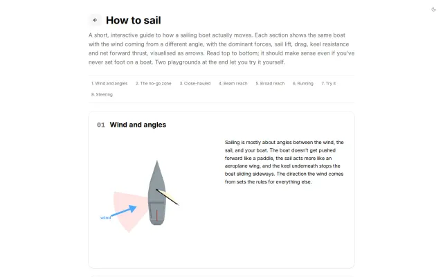
Vector arrows dynamically show why you can't sail straight into the wind.
Eye CandyCozyCrowd Pleaser
techfrog
201mo ago
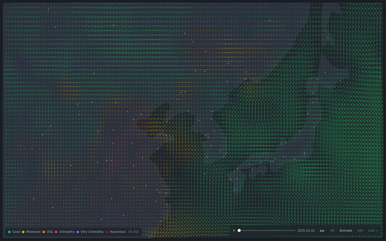
Animated wind vectors combined with selectable pollutant layers (PM2.5, PM10, NO2, etc.), playback speed and a date slider make it immediately useful for spotting transport patterns and hotspots. Feels like a focused, browser-hosted nullschool for pollution — visually effective but somewhat derivative, and the page doesn’t make the data sources or station-level provenance obvious.
Environmental researchers, public health professionals, commuters/travelers, and general public interested in air quality
Vector arrows dynamically show why you can't sail straight into the wind.
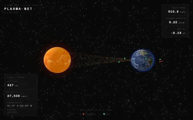
Live solar wind visualization layered over ISS tracking—neat combo nobody asked for.
Real-time world map of your connections makes invisible network activity visible.
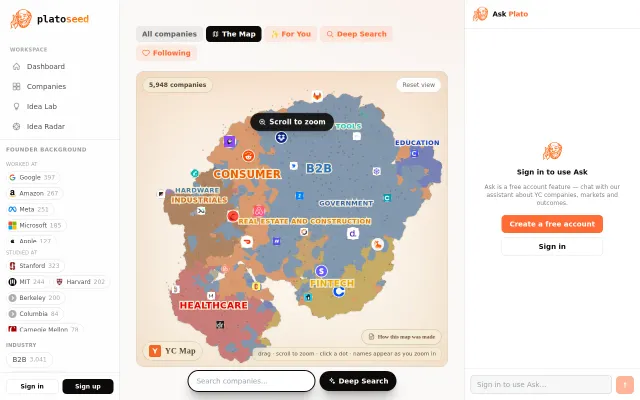
2D embedding visualization makes browsing 5000 YC companies genuinely explorable.
NOAA data visualized well, but Google Earth Engine already maps this.
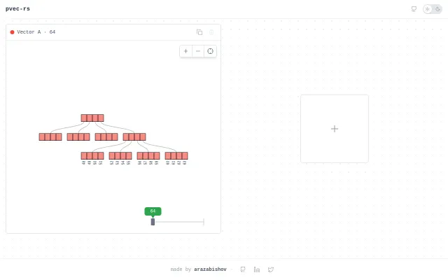
Dragging the timeline reveals how splits, concats and shared nodes evolve across versions, which makes an abstract data structure palpably understandable. Running the implementation in-browser via Rust→WASM is a neat technical demo, but it's primarily educational — more inline explanations or scenarios would make it genuinely useful beyond hobbyist exploration.