Productivity●Mid
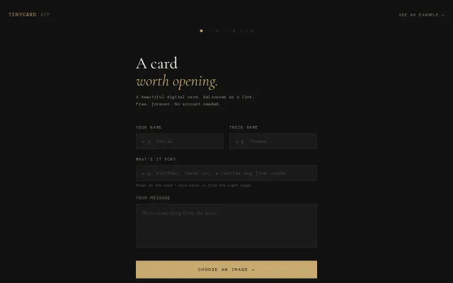
TinyCard – The TinyLetter of Greeting Cards
No-account e-card service with CSS 3D animations, but payment flow is broken.
CozyShip It
szemy2
242mo ago
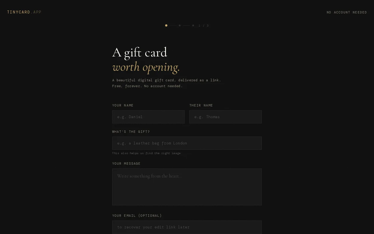
Tinyletter for eCards: no signup, minimal friction, actually looks good.
People sending gifts remotely who want a personalized, aesthetically pleasing alternative to generic eCard services.
Tinyletter · Canva Cards · Adobe Express
The shop didn't let me add a postcard or anything personal to the package so I went looking for an easy/fast eCard service that I considered aesthetically pleasing.
It was a very frustrating search. I thought of creating it with Figma but didn't feel like spending more time building a postcard design (also I wanted it to open in a cool way!!). So I created an app :D (cue Rick & Morty "lets-build-an-app" guy)
This was created with the sentiment how tinyletter (RIP) offered a functional/minimal solution to bloated software.
No-account e-card service with CSS 3D animations, but payment flow is broken.
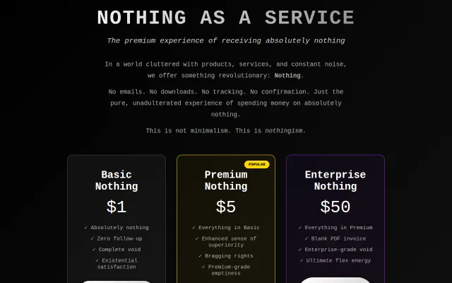
It charges for 'nothing' across $1/$5/$50 tiers and leans fully into the joke — no emails, no downloads, even a blank PDF invoice for enterprise. The copy and tiered structure are the product here: deadpan testimonials and precise restrictions (no confirmations, no follow-up) keep the gag consistent. Charming as a marketing stunt, but there’s no technical depth beyond a well-styled static page.
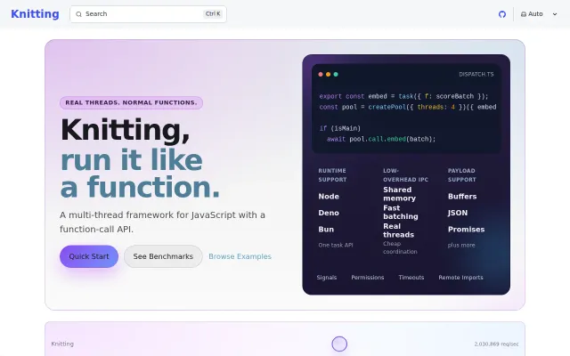
Swaps postMessage for shared memory, making cross-thread calls 3.5x faster in Deno.
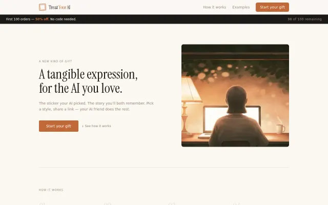
Hand-printed stickers designed by your AI — charming novelty for a specific audience.
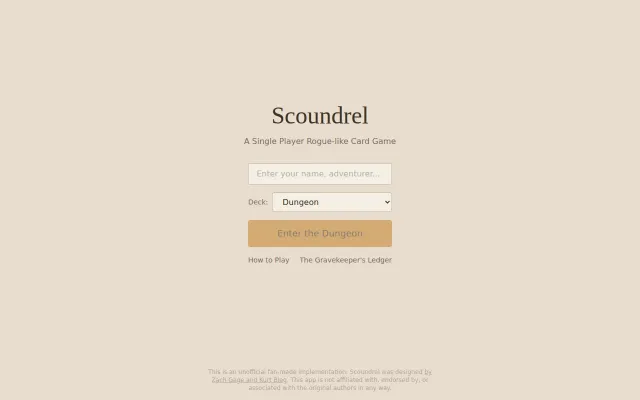
Faithful fan recreation of Scoundrel, but browser card games are a crowded category.
Startup pitch cards with analytics, but Carta, PitchBook, and AngelList already serve this.