Data●Mid
Does Big Government Kill Growth? The Armey Curve Tested (151 Countries)
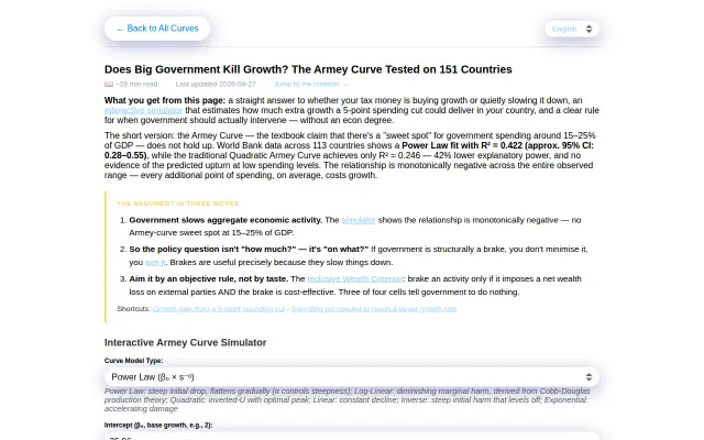
Interactive Armey Curve simulator challenges the 15-25% spending sweet spot theory.
Niche Gem
julienreszka
201mo ago

Concrete trade data visualization (dresses, yachts, wine) beats '$X billion' abstraction.
Economists, policy analysts, journalists, data visualization enthusiasts
Our World in Data · Gapminder · Google Trends
Instead of "$X billion in exports," it shows Italy shipped 96M dresses, 11K yachts, and 2.1B liters of wine.
Screenshots: https://imgur.com/a/kuxWr55
Covers 37 countries across trade (UN Comtrade), government spending (OECD/COFOG), revenue, debt, strategic resource dependencies, and 24 World Bank indicators.
Stack: Next.js + React + D3.js, FastAPI + SQLite backend.
Not live yet, sharing screenshots for feedback before launch. Curious if this is useful to anyone, or if I'm building for an audience of one.
Interactive Armey Curve simulator challenges the 15-25% spending sweet spot theory.
100+ structural coupling rules enforce causal economics across 195 countries with probabilistic outputs.
Ten-word news summaries feel more like a constraint than a feature versus InShorts.
Curated directory of gov repos, but GitHub Advanced Search already filters by topic and org.
Lens-based discussion framing is novel, but posts look like generic Twitter clones.
OECD-trained XGBoost model predicts policy outcomes when most simulators use arbitrary formulas.