Data●Mid
I built a risk map that adapts to your worldview
Policy preference toggles are clever, but NeighborhoodScout already does risk aggregation.
Solve My Problem
david1-618
202mo ago
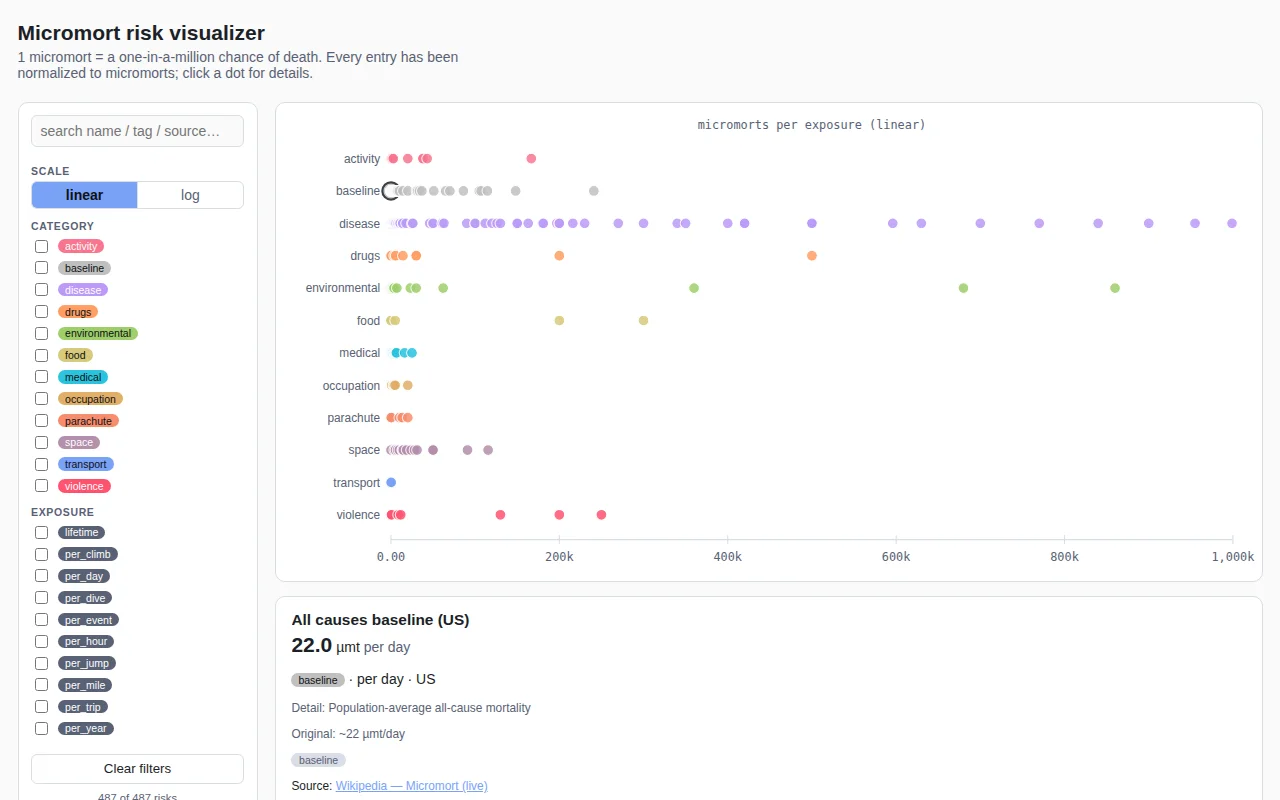
Sorting 487 risks by danger level is a genuine rabbit hole for the statistically anxious.
Data journalists, safety researchers, and risk-averse curious minds
Our World in Data · Wait But Why
Policy preference toggles are clever, but NeighborhoodScout already does risk aggregation.
Interactive decision tree viz for notebooks when dtreeviz already exists.
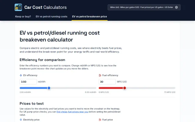
Heatmap visualization makes EV breakeven costs clearer than standard static calculators.
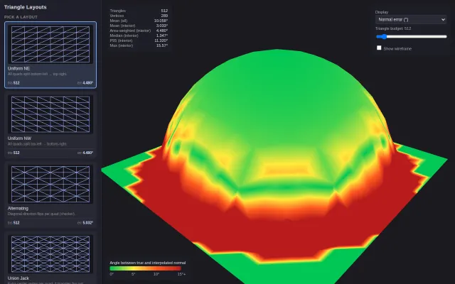
Visual proof that McGuire's 2005 isometric grid beats standard quad-splitting for normal interpolation.
Makes queue latency tradeoffs visible in seconds—great for architecture reviews and postmortems.
Sliding scale from 1 sat to 21M BTC with a working Geiger counter for plutonium.