Productivity●Mid
Arcadia – visualize your time on a 24-hour clock
24-hour clock visualization when RescueTime and Toggl already exist.
Cozy
Orbyss_Studio
118d ago
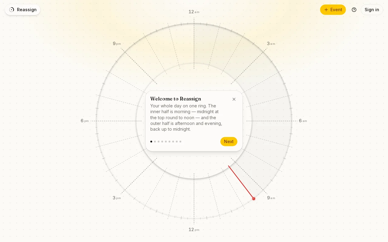
Circular day visualization beats linear calendars for spatial thinkers.
Time-blocking enthusiasts, visual planners who prefer circular over linear calendars
Sunsama · Motion · Timepage
Played around a bit and made a digital clone to speed things up: Reassign.app
Anyone else think of their day as a circle rather than a list?
24-hour clock visualization when RescueTime and Toggl already exist.
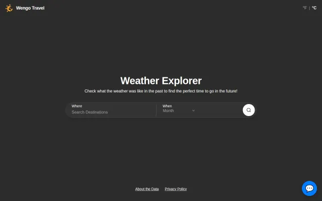
Historical weather by hour beats monthly averages for actual trip planning.
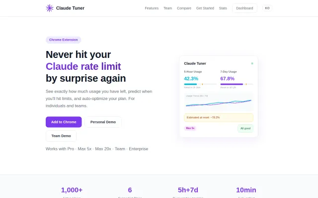
Yet another API usage tracker in a category full of them.
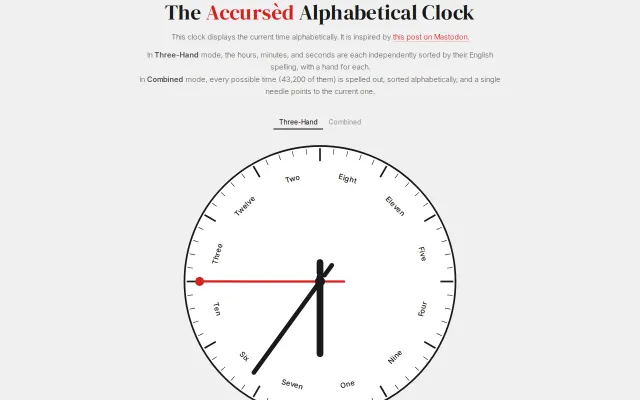
Sorts all 43,200 possible times alphabetically and points a needle to the current one.
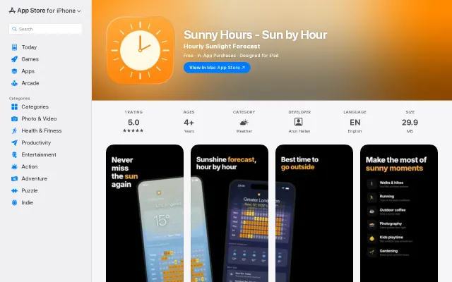
Nice sunshine heatmap UX but Apple Weather and Carrot already solve this.
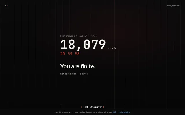
Clean mortality clock, but memento mori calculators have existed for decades with no technical differentiation.